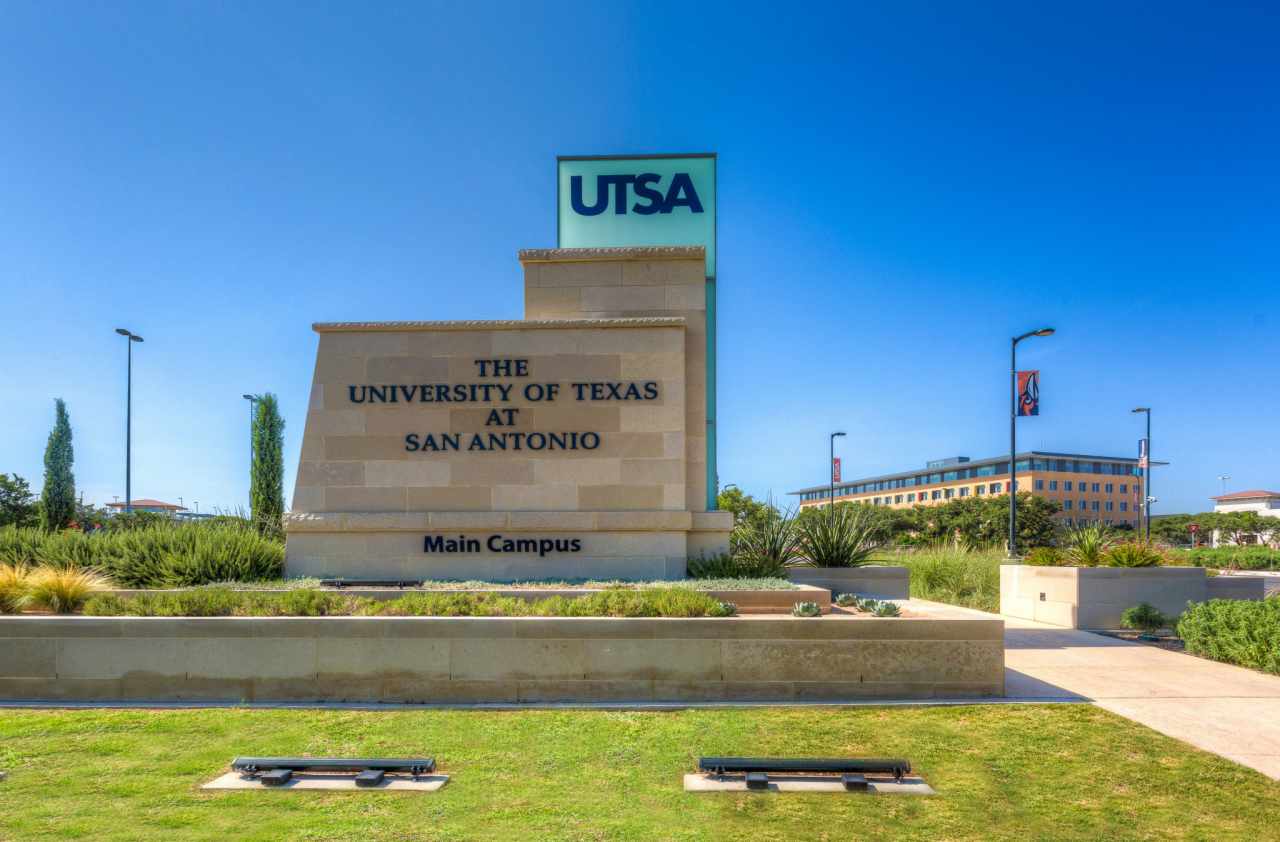
The University of Texas at San Antonio (UTSA) is a relatively new university in the state of Texas and was once known as small, and not viewed as in high standing. UTSA is currently viewed as a growing and soon to be top tier university. At the beginning of my senior year of high school, I was looking at what major I wanted and what college to attend. UTSA was not one of first choices. I got accepted into all the colleges that I applied for, including UTSA. It was the Communication major that UTSA offered that I entice me to go, along with the university being close to home in San Antonio. The Communication degree with a concentration in Digital Media stood out to me personally. I wanted a degree that was diverse and could be easily applied to any business. San Antonio is a growing city that is cultivating in new businesses, along with ample opportunity for internships and networking. The university residing in a city like San Antonio, made UTSA more attractive; which is why I chose to pursue a degree from UTSA.
I think that the layout is very easy on the eye which makes it easier to follow along and read. I really liked the soft colors that you used. Other than that I think that the structure of the body paragraph could be organized better; the first line is much longer than the rest of the paragraph. There are many grammatical errors and words left out that make it harder to follow along.
ReplyDeleteAlexandra,
ReplyDeleteI like how you incorporated the historical status of UTSA in your paragraph. Is this your first draft? If you plan to create another draft, maybe include a theme. I could only see a mountain in the back of the start of the blog; everything else was white, or off-white. That makes it uninteresting. I'd say more color to draw the eye towards what you want the reader to pay attention to, and more pictures.
Tamika Tutt